Jagged Graphics
Why are the graphics jagged?
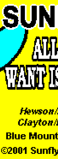
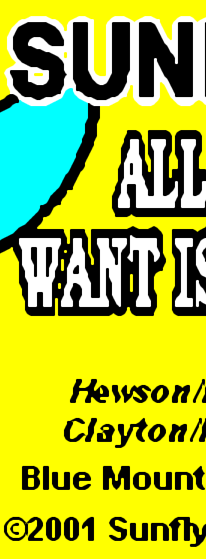
It's because the text and graphics are actually bitmaps, they're not "fonts" or "vectors" actually, they're made of pixels. The dimensions of CD+G graphics are 300 x 216. You'll notice that's very, very small. Now, when you display this on a "Standard Def" TV (720 x 480), the pixels are doubled so you get 600 x 432, which more or less fills the screen and with the colorized border still looks pretty good. The "problem" is when you view the graphics on a computer monitor or HDTV where you've got orders of magnitude more pixels to go around. Your original graphic is 300 x 216, so you have to STRETCH that to fill in more pixels. You know what happens when you zoom in to pixels? You get jaggies. I have turned on "CoreGraphics" on mac and GDI+ on windows, so now kJams will do bicubic smoothing on the graphics, which makes it a bit fuzzy, but i think it does look marginally better.
Update: I've now added optional HQX smoothing, which i think looks a bit better. You can turn it on in the General prefs if you like it. WARNING: it is very CPU intensive. If your computer slows to a crawl, then turn it off.

|

|

|
| "Nearest Neighbor" (before) | "Bicubic Smoothing" (after) | "Hq4x Smoothing" (after) |